
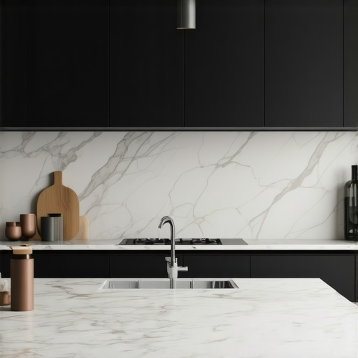
The Kitchen Lighting Strategy for Perfectly Even Countertop Visibility
Most luxury kitchen builds fail at the finish line because designers treat illumination as an afterthought. They throw a few recessed cans in the ceiling and call it a day. The result? A high-end workspace riddled with shadows precisely where you need clarity. After 15 years of engineering kitchen environments, I can tell you that throwing more lumens at a counter won’t fix a fundamental geometry error. True visibility requires a technical understanding of beam angles, color rendering, and the physical properties of your surfaces. When you are operating precision espresso machines or monitoring the crust on expensive proteins in air fryers, visual friction is your enemy. You don’t need more light; you need better-distributed photons.
The mechanics of even visibility start with the CRI, or Color Rendering Index. If your lights have a CRI below 90, your premium cookware looks dull and your ingredients look sickly. We utilize a high-density LED tape system with a minimum 95 CRI to ensure that the marbled fat in a steak or the fine grind of coffee looks exactly as it should. Placement is the next technical hurdle. Many installers tuck LED strips directly against the backsplash. This is a mistake. It highlights every minor irregularity in the tile and creates a ‘hot spot’ of glare on the rear of the counter. We mount our extrusions roughly two inches from the front lip of the upper cabinet, angled slightly toward the wall. This creates a cross-wash of light that fills the entire depth of the workspace.
Visibility is not just about brightness; it is about the interplay between light and surface texture. If you have chosen polished stone, you are dealing with a mirror.
The Glare Reduction Equation
When light hits a polished surface, it follows the law of reflection. Hard, undiffused LEDs create ‘specular highlights’—those annoying little dots of light that dance on your countertop. We solve this by using deep-channel aluminum extrusions with frosted polycarbonate diffusers. This effectively turns a point source of light into a linear source, softening shadows and reducing eye strain. This is particularly vital when you are working with stand mixers where you need to see the texture of a dough without being blinded by reflections off a stainless steel bowl. If you ignore this, the visual fatigue makes long prep sessions exhausting. I have seen clients spend $200,000 on a luxury kitchen only to find they can’t see their cutting board clearly at 7:00 PM. That is a failure of strategy.
Implementing this in the real world is messy. I remember a project in a coastal home where the client insisted on high-gloss black quartz. The reflection of the under-cabinet lighting was so intense it looked like a strobe light. We had to backtrack, replace the drivers, and install a PWM (Pulse Width Modulation) dimming system to lower the intensity without shifting the color temperature. Even then, the countertop depth mistake they had made earlier meant the light wasn’t hitting the prep zone correctly. You also have to consider the heat. High-output LEDs on for six hours can bake the underside of your cabinets. Without proper heat sinks, the adhesive fails, the strip sags, and your perfectly even visibility becomes a wavy mess of shadows within a year.
The Engineering Reality of Layered Control
A single switch for all kitchen lights is a sign of amateur design. You need a dedicated circuit for task lighting, separate from your ambient and accent layers. This allows you to kill the harsh overheads while keeping the work surfaces bright. If your kitchen island lighting feels harsh at night, it is likely because you are relying on pendants for task work rather than supplemental recessed spots. In the next 18 months, we expect to see a shift toward tunable white technology becoming the standard. This allows the kitchen to transition from a 4000K ‘clean room’ during morning prep to a 2700K ‘bistro’ feel for evening entertaining. It mimics the natural circadian rhythm and is a significant value-add for property resale. Also, keep an eye on local electrical code changes regarding AFCI protection; modern high-draw appliances like commercial-grade espresso machines require specific circuit planning that often conflicts with low-voltage lighting drivers.
My executive verdict is simple: Prioritize the CRI and the diffusion before you pick out the decorative fixtures. A pretty pendant won’t help you see a hairline crack in a ceramic bowl, but a properly placed 95+ CRI LED strip will. If you are currently in the planning phase, move your under-cabinet light placement forward by two inches and invest in frosted diffusers. The result is a shadow-free workspace that feels expensive because it functions perfectly. Stop focusing on the ‘look’ of the light and start focusing on the quality of the visibility. According to the Illuminating Engineering Society, the target for food preparation areas should be 50 foot-candles of light on the work surface. Most homes barely hit 20. Don’t be that homeowner.
Common Questions About Kitchen Visibility
Why does my lighting look yellow even though the box said white? This is usually a ‘binning’ issue at the factory. Low-end LEDs have wide tolerances. To fix this, only buy from manufacturers that guarantee ‘single-bin’ consistency, ensuring every foot of tape is the exact same Kelvin temperature. You should also consider how backsplash height and material color absorb or reflect that light.
Can I use wireless puck lights for task lighting? No. They lack the lumen output for true task work and the batteries fail at the worst times. For a luxury kitchen, hardwired linear systems are the only viable path. If you want dimmable under-cabinet lights, they must be integrated into the home’s electrical architecture from day one.
What is the best color temperature for food prep? 3000K to 3500K is the sweet spot. It is crisp enough to see detail but warm enough to keep the kitchen feeling like a home rather than a laboratory. Anything above 4000K starts to make blue-toned materials look sterile and uninviting.