How to Choose a Backsplash That Wont Look Dated in Three Years
Design trends move with the velocity of a social media algorithm, but demolition costs remain anchored in stone. Most homeowners select a backsplash based on what looks good on a filtered photo today, ignoring the structural and aesthetic decay that occurs when a ‘fad’ meets real-world kitchen use. After 25 years in the local renovation market, I have seen thousands of kitchens. The ones that look fresh a decade later share a specific architectural DNA. The ones that look like a 2018 time capsule? They always chased the high-contrast geometric craze. If you get this wrong, you are not just living with an eyesore; you are depressing the resale value of your luxury kitchen before the grout even fully cures.
The Physics of Timeless Materials
Stone and ceramic are the heavyweights for a reason. When we talk about longevity, we are discussing the refractive index of the surface. Cheap, high-gloss glass tiles often reflect light in a way that highlights every grease splatter and fingerprint, especially if your kitchen hood is making too much noise and failing to extract vapor properly. I prefer natural variations. A handmade Zellige tile or a natural marble slab offers what I call ‘visual forgiveness.’ Because no two pieces are identical, the eye does not fixate on minor imperfections or the inevitable aging of the house. The technical truth? Material weight matters. A heavy-bodied porcelain will resist thermal shock better than a thin, press-and-stick alternative. We measure success by the integrity of the bond and the neutrality of the palette.
The Grout Line Trap
The biggest indicator of an amateur design is the grout choice. High-contrast grout—think white subway tile with black grout—is a ticking clock. It creates a high-frequency visual pattern that the human brain eventually finds fatiguing. For a backsplash to endure, the grout must be an extension of the tile, not a boundary. Use epoxy-based grouts to prevent the yellowing and staining that plagues standard cementitious mixes. This is about chemistry, not just art. When you coordinate your backsplash with your surfaces, remember that why your new countertops keep getting etch marks often relates back to the cleaners you use, which can also degrade a low-quality backsplash finish. A unified color field expands the perceived space of the room. It feels intentional. It feels permanent.
The Lighting Intersection
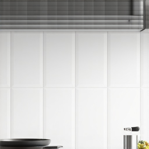
A backsplash does not exist in a vacuum; it exists under your cabinetry. I have walked into multi-million dollar homes where the backsplash looks cheap because the owner installed cool-blue LEDs. The result? A clinical, shivering environment. To keep a backsplash from looking dated, you must master the Kelvin scale. Warm white light in the 2700K to 3000K range brings out the depth in stone and the texture in ceramic. This is a non-negotiable standard. If you want to see why this is a dealbreaker, look at why your cabinet lighting should always be warm white to understand the color rendering index. Without proper illumination, even a $200-per-square-foot marble will look like gray plastic by year three. We also see a shift toward functional additions like the pot filler. Understanding why your modern kitchen reno needs a pot filler helps integrate the backsplash into the utility of the cooking zone rather than treating it as a mere sticker on the wall.
Market Corrections and Future Proofing
The industry is moving away from the ‘feature wall’ mentality. We are entering an era of quiet luxury and integrated surfaces. Expect to see more full-slab backsplashes that match the countertop exactly. This eliminates grout lines entirely and creates a monolithic, architectural look that is nearly impossible to date. Regulatory shifts in some jurisdictions are also pushing for non-porous surfaces that meet stricter hygiene standards, similar to those found in the Tile Council of North America (TCNA) handbooks. If you are planning a renovation in the next 12 to 24 months, lean toward larger formats. Fewer breaks in the surface mean fewer opportunities for the design to feel ‘busy.’ The ‘busy’ look is what dates a kitchen faster than anything else.
The Executive Verdict
My recommendation is clear: Buy for texture, not for pattern. If you are in a high-use kitchen with premium cookware and professional-grade heat, stay away from resins and plastics. Hold your position on neutral tones—whites, creams, or soft grays. If you want a ‘pop’ of personality, do it with your espresso machines or stand mixers, items that can be swapped in five minutes, not with the wall that requires a jackhammer to change. Focus on the installation quality. A $5 tile installed with laser precision will outlast a $50 tile installed with uneven spacers. Stick to the standards set by the National Kitchen & Bath Association (NKBA) regarding clearance and heat resistance. Strategy wins over style every single time.
Backsplash Longevity FAQ
Is subway tile officially dated? No, but the 3×6 format is overused. Move to a 2×10 or a vertical stack to keep the classic feel without the ‘builder-grade’ baggage.
How do I prevent my backsplash from staining behind the stove? Use a single-piece stainless steel or stone riser for the first six inches above the range, then transition to tile. This handles the highest heat and grease loads.
Should I take the tile all the way to the ceiling? Yes. Ending the tile at the bottom of the cabinets creates a horizontal line that shrinks the room. Taking it to the ceiling provides a finished, custom architectural look.
What is the best grout for a busy kitchen? High-performance epoxy grout is the only answer. It is non-porous, stain-resistant, and does not require sealing, unlike traditional grout.