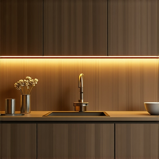
Why Your Cabinet Lighting Should Always Be Warm White
Most luxury kitchen builds fail at the finish line because of a fundamental misunderstanding of the Kelvin scale. You spend fifty thousand dollars on custom walnut cabinetry and another twenty on Calacatta marble, only to douse the entire space in 5000K ‘daylight’ LEDs that make your home feel like a clinical urgent care center. After fifteen years of diagnosing lighting failures in high-end residential projects, I can tell you that color temperature is not a matter of ‘personal preference’—it is a technical requirement for material integrity. Light is the final layer of your architecture. If you get it wrong, you’ve effectively flushed your design budget down the drain.
The argument for warm white, specifically in the 2700K to 3000K range, centers on the Spectral Power Distribution (SPD) of the light source. Warm LEDs mimic the incandescent glow we have evolved to associate with safety and nourishment. When you use cooler temperatures, you introduce a massive blue spike in the spectrum. This blue light reflects off polished surfaces, such as your stainless steel air fryers and premium cookware, creating harsh glare that strains the eyes. The goal of under-cabinet lighting is to provide task illumination without turning your kitchen into a lab. High-end wood finishes contain red and orange undertones. Cool light cancels these out, leaving your expensive wood looking gray and lifeless.
The Physics of Color Rendering
Designers often talk about the Color Rendering Index (CRI), but they forget about the R9 value. R9 specifically measures how a light source renders strong red tones. Most cheap, cool-white LEDs have an abysmal R9. In a kitchen, this is a disaster. It makes fresh produce look unappetizing and high-quality meats look sickly. By sticking to warm white with a CRI of 90 or higher, you ensure that the red tones in your granite countertops and cherry cabinets pop with the intended vibrancy. The result? A space that looks as expensive as it actually was.
Beyond aesthetics, there is the issue of photopic vs. scotopic vision. High-Kelvin lights are perceived as brighter by the eye, which causes the pupil to constrict more than necessary. This paradoxically makes it harder to perform precision tasks like dicing vegetables or dialing in a high-end espresso machine. Warm white allows for a more relaxed ocular response while still providing enough lumens for safety. According to the Illuminating Engineering Society (IES), lighting should be designed for the specific activity of the room, and for residential food preparation, a warmer, high-CRI environment promotes better visual acuity over long periods.
The ROI of Proper CCT
We need to talk about the financial reality of lighting. Poorly chosen lighting is the primary reason for ‘buyer’s remorse’ in modern renovations. I have seen clients rip out thousands of dollars in tile because they thought the color was wrong, when in reality, the 4000K under-cabinet strips were just distorting the pigment. This is why why under-cabinet lighting makes or breaks your backsplash. If you install a warm white system from the start, you avoid the costly cycle of troubleshooting ‘ugly’ finishes that are actually beautiful under the right light.
Consider the ‘Hospital Effect.’ Cold light triggers a cortisol response. It’s great for a 2:00 AM shift in an ER, but it’s the last thing you want when you’re enjoying a glass of wine or preparing a meal. Warm white light supports our circadian rhythms. It signals to the brain that the day is winding down. For a space that serves as the heart of the home, the psychological impact of 2700K lighting cannot be overstated. It transforms a functional room into a sanctuary.
Market Corrections and Future Trends
The industry is currently moving toward Tunable White technology, which allows you to shift the Kelvin throughout the day. While this is an innovative leap, the baseline should always remain rooted in the warmer end of the spectrum for evening use. Over the next 12 to 24 months, I expect to see a massive shift away from ‘smart’ bulbs that prioritize color-changing gimmicks in favor of high-fidelity, fixed-warmth LEDs. Smart money is being invested in light engines that prioritize the R9 through R15 values over raw lumen output. The American Lighting Association has noted a significant uptick in demand for warm-dim technology, where the light becomes warmer as it is dimmed, mimicking the physics of a flame.
The Executive Verdict
If you are currently selecting lighting for a renovation or new build, my recommendation is a hard ‘Buy’ on 3000K high-CRI LED strips. It is the gold standard for a reason. It bridges the gap between the yellow ‘muddiness’ of old 2700K bulbs and the sterile blue of 4000K commercial lights. Avoid the ‘Daylight’ marketing trap at all costs. It is a misnomer that leads to poor design outcomes. The only exception is if you are running a commercial-grade bakery where color matching under warehouse conditions is required. For everyone else, keep it warm. Your cabinetry, your stone, and your eyes will thank you. The real reason your new kitchen feels cluttered is often just poor light distribution creating dark corners and high-contrast shadows. Warm, wide-angle diffusion solves this instantly.
FAQ
Q: Is 3000K too yellow for a modern kitchen?
A: No. At 3000K, the light is crisp and white but retains the red-spectrum energy needed to make materials look natural. It only looks yellow if you are comparing it directly to a blue-tinted 5000K source.
Q: Does warm white use more electricity?
A: Technically, cool white LEDs can be slightly more efficient in terms of lumens-per-watt, but the difference is negligible in a residential setting. You are talking about pennies per year for a massive increase in visual quality.
Q: Should I match my overhead lights to my under-cabinet lights?
A: Yes. Mixing color temperatures is a cardinal sin of design. It creates ‘color banding’ that makes your walls look striped. Always sync your CCT across all layers of light in the same room.
Q: Can I use warm white with white cabinets?
A: Absolutely. It prevents white cabinets from looking ‘blue-cold’ or ‘gray.’ It gives them a soft, cream-like richness that feels significantly more high-end.