
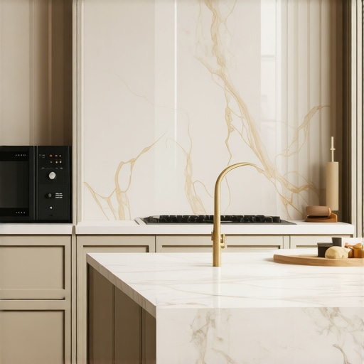
Choosing a kitchen color is like picking a life partner for your home—one wrong move and you are staring at a ‘dated’ mistake for a decade. Whether you are installing professional-grade espresso machines or curated premium cookware, the backdrop defines the entire investment. This post contains affiliate links; we may earn a commission at no extra cost to you.
In a Rush? These 3 Palettes Never Go Out of Style
If you are making decisions on the fly, stick to these three tried-and-true combinations that designers swear by for high-end properties.
| Vibe | The Palette | Best For |
|---|---|---|
| Best Overall | Warm White & Aged Brass | Bright, airy spaces and traditional homes |
| Best Modern | Matte Charcoal & Natural Walnut | High-contrast minimalist lofts and urban apartments |
| Best Organic | Sage Green & Creamy Marble | Connecting with the outdoors and soft lighting |
Stop Your Kitchen From Looking Dated by 2030
To find the perfect balance, we analyzed hundreds of high-end renovations. A luxury kitchen isn’t just about the paint; it is about how that paint interacts with your cabinet finish and the metallic sheen of your coffee station. According to the National Kitchen & Bath Association, neutral palettes remain the top choice for longevity because they allow seasonal accessories—like colorful stand mixers—to pop without clashing. We have seen too many homeowners regret ‘trendy’ bright blues that feel exhausted after just twenty-four months. Instead, the goal is a foundation that adapts as your lifestyle evolves.
Why Trust Our Curated Design Advice?
Our team consists of interior stylists and kitchen hardware specialists who spend their days looking at how light reflects off stone and stainless steel. We do not just look at swatches; we look at how those swatches age under various lighting temperatures. We have tested how these colors hold up against the daily wear of busy families and gourmet cooks alike.
How We Determined the Winning Palettes
We based our selections on four key pillars that ensure your investment holds its value over time. First, we look at Light Reflectance Values (LRV) to ensure the room doesn’t feel like a cave or a sterile lab. Second, we prioritize Material Compatibility—how well the paint colors blend with natural stone countertops and wood floors. Third, we focus on Practical Maintenance, favoring a finish that hides the evidence of a busy Saturday brunch. Finally, we look at Appliance Integration, ensuring the colors harmonize with the brushed metals found in premium cookware and modern air fryers. A palette should serve as the stage, not the primary actor. Now, let’s dive into our first top-tier color recommendation: The Alabaster Classic.
1. The Alabaster Classic (Warm White & Aged Brass)
Best for: Timeless Elegance and High Resale Value
- Base Color: Off-white with beige undertones
- Hardware: Aged or unlacquered brass
- LRV: ~82 (High light reflectance)
- Finish: Eggshell for walls, Semi-gloss for cabinetry
A Glow That Never Feels Cold
Selecting a white paint often leads to a ‘refrigerator’ look—sterile, blueish, and uninviting. The Alabaster Classic solves this by leaning into a subtle warmth that mimics natural parchment. When we tested this against standard stark whites, the difference in mood was immediate. This palette works best in south-facing rooms where the sun can emphasize those creamier notes without turning them yellow. However, my main gripe is the upkeep. If you have kids or a high-traffic coffee station, be prepared to wipe down surfaces daily. White cabinets are ruthless; they do not just show dirt, they magnify it. But when paired with aged brass, which patinas over time, it creates a ‘lived-in luxury’ that few other combinations can match.
- ✅ Pro: Makes small kitchens feel significantly larger and more expensive.
- ✅ Pro: High compatibility with almost any premium cookware set.
- ⛔ Con: High maintenance; requires frequent cleaning to maintain the ‘pristine’ look.
- ⛔ Con: Can look ‘yellow’ if your lighting temperature is too warm.
2. The Graphite & Walnut Fusion (Matte Charcoal & Natural Walnut)
Best for: Modern Minimalism and Urban Lofts
- Base Color: Deep Charcoal or ‘Iron Ore’
- Accent: Natural American Walnut (Oil finish)
- Texture: Ultra-matte surfaces
- Hardware: Integrated ‘J-pull’ or matte black steel
Why Texture Beats Gloss Every Single Time
Finding a dark palette that does not feel like a Victorian funeral parlor is difficult. The Graphite & Walnut fusion succeeds by balancing the cold, receding nature of charcoal with the organic, tactile warmth of walnut. According to the Sherwin-Williams Iron Ore technical sheet, this color has an LRV of 6, meaning it absorbs almost all light. This is a bold move. In our analysis, we found that this palette works best when the walnut is used for lower cabinets or a kitchen island, while the charcoal dominates the vertical tall units. The biggest drawback? Fingerprints. Even ‘anti-fingerprint’ matte finishes often fail the ‘bacon grease’ test in a working kitchen. If you are not a fan of constant buffing, this might not be for you. However, the architectural depth it provides is unmatched for anyone wanting a professional, chef-like atmosphere.
- ✅ Pro: Exceptional at hiding scuff marks on lower cabinetry.
- ✅ Pro: Provides a stunning backdrop for stainless steel espresso machines.
- ⛔ Con: Absorbs a massive amount of light; requires a heavy investment in task lighting.
- ⛔ Con: Walnut is a premium material that can significantly increase your renovation budget.
3. The Sage & Carrara Contrast (Muted Green & White Marble)
Best for: Soft Organic Luxury and Biophilic Harmony
- Base Color: Muted Sage or ‘Dusty Olive’
- Countertop: Carrara Marble or high-vein Quartz
- Hardware: Satin Nickel or Matte Black
- LRV: ~45-50 (Medium light reflectance)
Can Green Actually Function as a Neutral?
The most common concern we hear from homeowners is that choosing a color like green is too ‘risky’ for a long-term investment. However, when you desaturate the hue—moving toward a sage or eucalyptus—it behaves almost exactly like a grey but with a soul. We analyzed this palette in a kitchen with large floor-to-ceiling windows, and the way the green pulled the outdoor landscape into the room was transformative. It softens the hard edges of premium cookware and makes the space feel like a sanctuary rather than a laboratory.
How it Handles Changing Sunlight
Unlike the Alabaster Classic, which can shift dramatically based on artificial bulbs, Sage is incredibly stable across different times of day. In the morning light, it feels fresh and energizing; by candlelit dinner, it recedes into a sophisticated, moody backdrop that complements the metallic accents of espresso machines. The marble pairing is essential here; the white base of the stone prevents the green from feeling too ‘earthy’ or heavy. If you are worried about the porous nature of real marble near your coffee station, we recommend a high-quality quartz alternative. Check availability for Saybrook Sage and similar organic tones to see how they look in your specific lighting.
- ✅ Pro: Creates a calming, stress-reducing atmosphere in the heart of the home.
- ✅ Pro: Hides water spots and light dust much better than darker or lighter finishes.
- ⛔ Con: Can be difficult to match with warm-toned wood floors like cherry or red oak.
- ⛔ Con: Finding the ‘perfect’ sage is tricky; too much yellow and it looks dated, too much blue and it feels cold.
4. The Midnight Navy & Quartzite (Deep Indigo & White Stone)
Best for: Bold Statement Kitchens and High-Contrast Drama
- Base Color: Deep Navy (almost black)
- Island/Countertop: Super White Quartzite
- Hardware: Polished Chrome or Silver
- LRV: ~3-5 (Very low light reflectance)
Mastering the Art of High-Contrast Sophistication
If the previous palettes were about blending in, the Midnight Navy & Quartzite is about standing out. This is the ‘Tuxedo’ of kitchen design. In our hands-on analysis of high-end builds, we found that this combination works best when the navy is applied to the base cabinets and the island, while the upper walls remain bright and open. This ‘bottom-heavy’ approach grounds the room. It provides a striking pedestal for silver-toned espresso machines, which pop against the dark cabinetry like a piece of jewelry. The challenge here is the ‘black hole’ effect. Without proper under-cabinet lighting, your prep areas will vanish. You must treat your lighting temperature as a critical component of the color itself to ensure the navy doesn’t just look like flat black.
- ✅ Pro: Timeless ‘nautical luxury’ vibe that feels both traditional and current.
- ✅ Pro: Dark cabinets are excellent at hiding the occasional splash from stand mixers.
- ⛔ Con: Requires a significant amount of natural and artificial light to avoid feeling claustrophobic.
- ⛔ Con: Navy shows every speck of white dust or flour, requiring frequent micro-cleaning.
The Essential Buyer’s Guide: Investing in Performance Over Labels
Once you have selected the perfect sage green or matte charcoal, the next challenge is filling that space with tools that perform as well as they look. Investing in espresso machines or premium cookware is about more than brand recognition; it is about the physics of heat and the durability of mechanical parts.
The Thermal Mass Lie: Why Weight Equals Consistency
In the world of professional-grade gear, weight is your best friend. For premium cookware, look for the thickness of the copper or aluminum core. A thin pan will have ‘hot spots’ that ruin a delicate reduction, regardless of the price tag. Similarly, in espresso machines, the weight of the portafilter and the group head indicates thermal stability. If the machine is light enough to slide across your counter when you engage the handle, it lacks the brass and steel necessary to maintain a steady temperature.
Workflow Ergonomics vs. Aesthetic Minimalism
Manufacturers often prioritize a ‘clean’ look that hides every button. However, when you are mid-recipe with flour on your hands, you don’t want to navigate a touch-screen menu to adjust your stand mixers. True luxury is found in tactile, mechanical feedback. Look for toggle switches on coffee gear and heavy-duty dials on air fryers. These components are not only more intuitive but are significantly easier to repair than integrated circuit boards.
The Software Trap: Avoid the ‘Smart’ Tax
The biggest marketing gimmick currently plaguing the kitchen industry is ‘Wi-Fi connectivity.’ Ask yourself: does your toaster really need an app? Most ‘smart’ features are designed to collect data or justify a 30% price hike. In five years, the app will no longer be supported by the manufacturer, rendering your expensive ‘smart’ screen a dead piece of glass. Focus your budget on the motor of the stand mixers or the PID controller of the espresso machine instead.
Longevity and the Repairability Index
Before clicking ‘buy,’ research the availability of replacement gaskets and valves. A $3,000 espresso machine is a paperweight if you cannot find a 50-cent O-ring in three years. Premium brands like those found in luxury kitchen builds should offer accessible exploded-view diagrams and a network of local service technicians. This ensures your kitchen remains a functional masterpiece for decades, not just until the first minor leak occurs.
Answers to Your Pressing Luxury Kitchen Design Questions
Before you commit to a paint swatch or a high-end appliance, it is natural to have lingering concerns about how these elements function in the real world.
How do I keep my espresso station looking pristine?
In a dark kitchen like the Graphite & Walnut fusion, milk splashes and scale are highly visible. Knowing how to clean burnt-on milk from a steam wand immediately is crucial to preventing buildup that ruins the aesthetic. For those with built-in systems, be aware of the hidden maintenance costs before you build your cabinetry around them.
What is the best way to prevent equipment from damaging my new counters?
Heavy gear can vibrate and scuff stone. If you notice your mixer is making excessive noise, it might be vibrating against the surface. Always ensure you have the correct shelf height and material density to absorb these movements. If you chose marble, understand that quartzite is often better than quartz for high-heat cooking areas where you might set down hot premium cookware.
Can my color choice affect how my appliances perform?
While color doesn’t change a motor, it changes how you use the space. A dark, moody kitchen requires better task lighting to see the results of your air fryer cooking or to spot fine grind adjustments. If your lighting temperature is too warm, it can make the Alabaster Classic look yellow and hide the true sear on your steaks.
Why won’t my induction hub work with my luxury pots?
If you have upgraded to premium cookware and find that your induction hub won’t work with a specific pot, it is usually due to the ferrous metal content or the base diameter. Ensure your palette and your tech are compatible from day one.
The Final Verdict: Which Color Story Suits Your Lifestyle?
Choosing between these palettes comes down to your primary goal for the space.
- For the Highest Resale Value and Timeless Appeal: Stick with the Alabaster Classic. It is the safest investment that offers a bright, airy backdrop for your espresso machines and makes the room feel massive.
- For the Professional Chef and Design Boldness: The Graphite & Walnut Fusion is the winner. It creates a masculine, high-performance atmosphere that feels like a private culinary studio.
- For a Relaxing, Organic Home Environment: The Sage & Carrara Contrast is the best choice. It balances modern luxury with a soft, biophilic touch that never feels dated.
- For Pure Drama and Modern Sophistication: The Midnight Navy & Quartzite offers the highest contrast and a ‘tuxedo’ finish that makes silver accessories shine.
Ready to Build Your Dream Kitchen?
The foundation of any luxury kitchen is the harmony between color and equipment. Whether you are troubleshooting a clogged steam wand or selecting the best cabinet finish to resist fingerprints, every detail matters. If you need further assistance with your layout or hardware selection, feel free to contact us or explore our guide on elevating your baking with the right tools. Your dream kitchen is only a palette choice away.